Blue
Colours on the blue side of the spectrum — which also includes shades and tints of secondary colours like green — are ‘cool’ colours. They have a calming effect, reducing anxiety and promoting concentration.
Blues are also associated with intellect and deep thought, so can be appropriate for research, work or quiet spaces. Studies have backed this up — there is a strong relationship between a calm mood and a preference for blue. The colour is even considered to facilitate concentration and learning.
Individuals with ADHD or anxiety disorders may particularly benefit from its strategic use.

Green
Green is another ‘cool’ colour, but with a closer association with nature. It has an emotionally calming, refreshing effect, helping to enhance creativity.
Indeed, a large academic review study stated that green produces the most positive emotional responses, largely thanks to its association with calmness and happiness. This can make it suitable for almost all neurodiverse individuals.
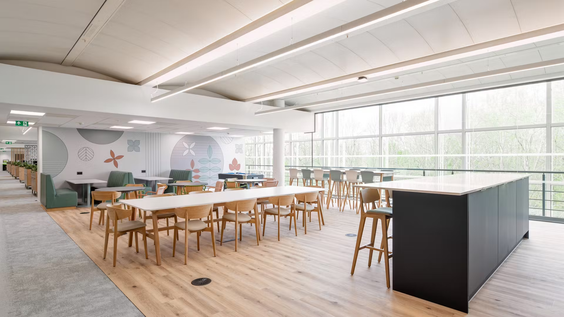
This colour is easy on the eye and helps us adapt to new environments, so it may be particularly popular for reception spaces — don’t forget that guests and clients may be neurodiverse. Like blue, it can also work well for individual desks, lounges or breakout spaces.
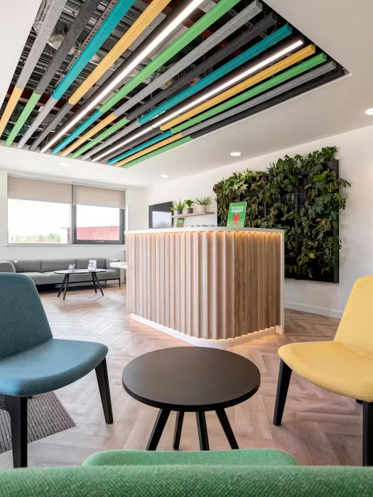
Green also works well with plants and other biophilic design elements, which we know helps with stress relief.

Yellow
On the other side of the colour spectrum, you have the ‘warm’ colours like yellow. It is an energising colour, promoting optimism, happiness, playfulness, joy and even childishness.
In large doses, it has the potential to overwhelm and agitate, so it may be best suited for use as an accent colour rather than the main colour scheme. A solution for more liberal use of the colour may be a pastel yellow.

Red
A strong, powerful and fiery colour, red leaves little room for subtlety. It is most associated with the body, grabbing our attention, stimulating us and imparting a sense of urgency.
When the right shade of red is chosen, we can feel invigorated, but it also has the potential to overstimulate and tire our eyes — a particular consideration for neurodiverse individuals. An academic review study found that red environments can be considered irritating and disturbing.
Like yellow, consider using muted tones or adopting it simply as an accent colour.

Orange
As you may expect, orange provides a balance between these two aforementioned ‘warm’ colours, sitting between them on the colour spectrum.
It can energise and uplift, providing a sense of enthusiasm and cheeriness — another contender for any reception space. Using it sparingly, or in the right calmer shade, can add more energy to a room.

Neutrals
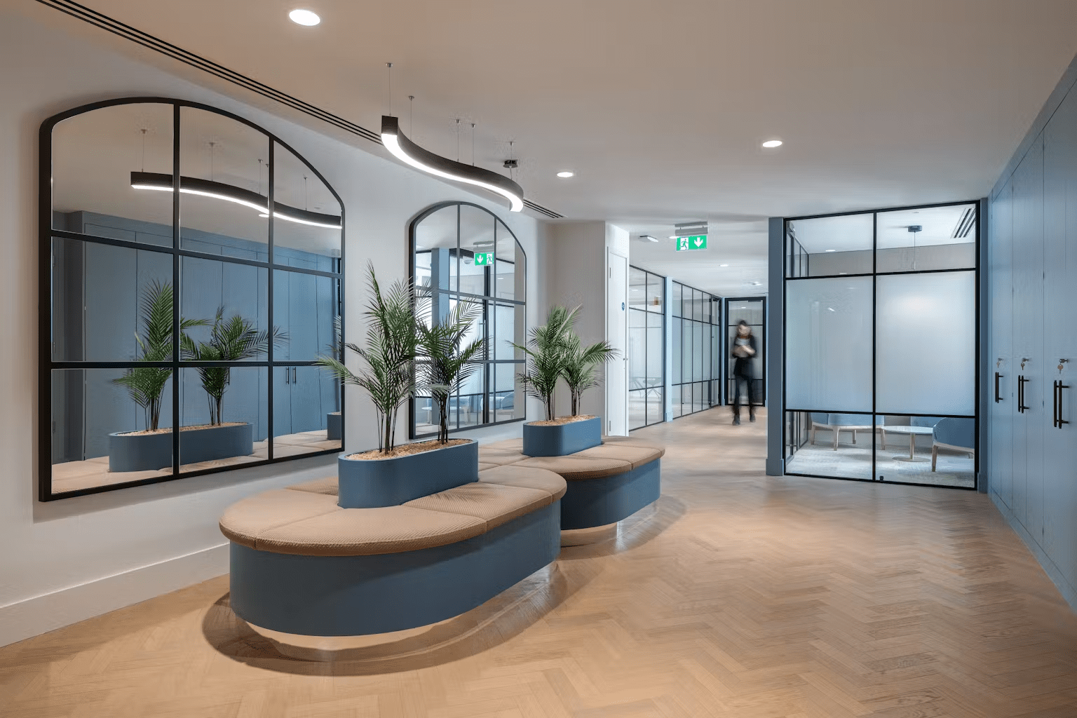
Whites, greys and beige don’t provide a particularly strong or distinct psychological effect, so can be a calming backdrop for individuals who are sensitive to sensory stimuli.
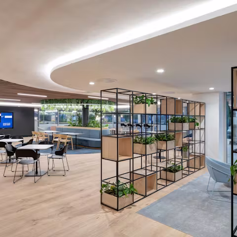
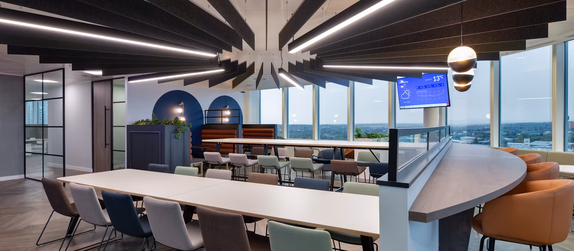
The potential for neutrals are almost limitless — they add a clean, minimalist look to recreational zones, meeting areas and collaborative spaces whilst leaving room for accent colours and flourishes.
As well as working well where there’s plenty of natural light, neutral colours also help to make smaller spaces feel larger and more open, encouraging occupant relaxation.

Black
A mention for black: while it is associated with control, power, and mystery, it can create a striking and dramatic effect in a room. Used thoughtfully, black can add depth and sophistication to your space. However, it’s important to balance it with lighter tones to keep the atmosphere uplifting. Additionally, black absorbs heat, making it a cosy choice for cooler days.

The Best Colours to Use When Designing an Office for Neurodiversity
As we mentioned, for neurodiverse people who may have particular sensitivities or tendencies to be visually overstimulated, colours take on added significance. It’s essential to strike a balance between stimulating and calming elements.
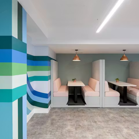
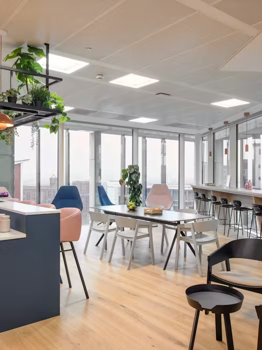
Soothing colour palettes and muted tones are generally good practice when designing for neurodiversity. Soft blues are ideal for walls, furniture and decor, helping to create a calming, secure space for focus and productivity — perhaps a work studio or quiet zone.
Light blue-green hues and turquoise can work similarly well in providing visual relief, sitting on the ‘cool’ side of the colour spectrum and being welcoming for those with sensory issues. A soothing backdrop with neutral tones like light beige and calming cream can provide the perfect break from a distracting, busy office environment.
Elements like wood and plants — which naturally involves the use of greens — create a calming effect, a connection to the outdoors and a sense of creativity. Studies have highlighted that green spaces with plants can increase workplace satisfaction, self-reported levels of concentration and even perceived air quality.
Minimise noisy, loud colours like red and bright yellow — deploy them more as an accent colour for furniture, decor or accessories. Avoid bold patterns that suddenly change; they can be confusing and overstimulating.
Other Considerations on Colour Use for Neurodiversity: Lighting, Fabrics, Signage, Room Size
In your design, allow room for individual preferences. Dynamic features like adjustable lighting can create a sense of ownership over the space — great for employee workplace satisfaction. Soft, diffused lighting creates a calm environment.
Often, the building itself will help to shape and dictate the colour scheme. Each project is different. Are rooms lit artificially or naturally? Think about how the colours will work with surface materials and fabrics — some absorb light, others reflect it.
Elements like flooring, carpet tiles, coloured walls and partitions are other ways that colour can be used to adapt and theme a space for its neurodiverse occupants. Clear signage and colour-coded labels can aid navigation and cognitive organisation.
Just touching on signage, avoid the high contrast of pure black text on a pure white background — these can be particularly challenging for those with dyslexia. Instead, think background colours like soft cream, off white and light grey.
DENTON, creating inspiring, inclusive workspaces
When used smartly and strategically, colour helps to empower neurodiverse people, unlocking their unique talents.
Since 1996, we’ve partnered with some of the world’s most iconic brands to create innovative, accessible workspaces where everyone can thrive.
With offices in London, Manchester and Liverpool, DENTON’s talented in-house team are industry leaders in interior design, procurement, delivery, furniture and visualisation.
We approach all of our projects as a collaborative partnership. So, whether you need us for the full office design and build, detail and build or simply for furniture procurement, we can slot seamlessly into your next project.
To inspire your next project, take a look through our neurodiversity hub for more expert insights and examples of accessible office design. Or, if you’re ready to discuss your next design or fit-out, drop a message to our team today.